Every year, thousands – if not hundreds of thousands – of professionals attend trade shows relevant to their industry. While many attendees are intrigued by these types of events, many marketing and event professionals recognize the importance of trade shows as an opportunity for face-to-face interaction with potential customers, new product demonstrations and brand recognition. Regardless of the size of an exhibit, every business wants to be noticed and stand out from their competition on the show floor. However, at every event, some exhibits fall short of this goal. Have you ever wondered why?
Although many exhibitors place blame on the location or size of their exhibits as the reason for low booth traffic, they typically don’t consider how color schemes might play a role. When it comes to the design of your exhibit, here are key insights on how to integrate color psychology into your next trade show booth design.
Defining Color Psychology
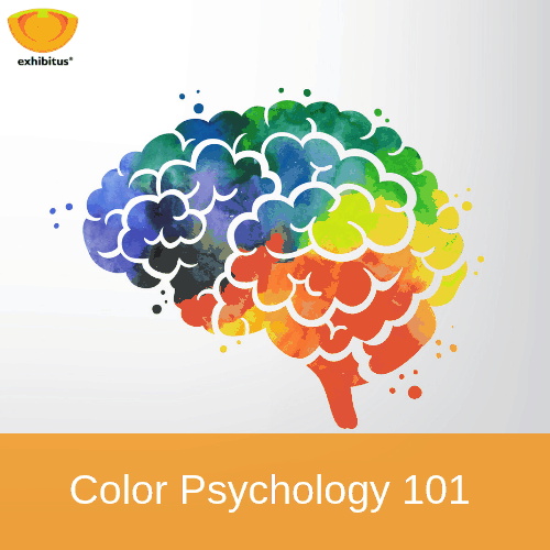
While color interpretation is dependent on personal experiences, research suggests color can persuade consumers. Marketers tap into this research and apply it in many ways to influence the results of their business. Moreover, color psychology suggests various shades can create certain moods to influence the decisions people make. Vivid and lively colors, for example, can inspire verse and song, while drab and dull colors can dampen even the highest of spirits.
For many companies, the color schemes used in custom trade show exhibits has as much power as their logo or even the brand itself. However, the key with all brands and their associated color schemes is to remember each color applies to a specific context. In short, your color scheme should reflect your brand and corporate personality while simultaneously complementing your message.
The Color Breakdown
Although different colors yield varying reactions from people, there are many colors that universally trigger similar emotional responses from most people:
- RED – a powerful and attention-getting color, it can also be agitating. Use this color wisely such as in areas where you want people to quickly notice information then move along to another area within your trade show booth.
- ORANGE – an exciting and bold choice, use this color strategically as you don’t want to emotionally overload the spectators’ senses.
- YELLOW – generally used to invoke happiness and encourages people to take action, yellow is a great color to use in areas where you want people to learn or remember key information about your products or services.
- GREEN – recognized as an earthly color, green denotes growth and calms people’s moods. Use this color in areas of your trade show exhibit where you want to engage attendees in conversation. .
- BLUE – depicted as a color to promote stability and safety, make sure to use this color, or variations of this color, sparingly. Light blue, for example, is a very relaxing color, so don’t use it in areas where you intend visitors to sit for more than ten minutes – they might get too relaxed!
- INDIGO – a blend between deep blue and violet, indigo is seen as a dignified color conveying a sense of integrity and sincerity. Use this color in areas of your exhibit to drive home a critical message aimed at specific targets.
- VIOLET – most often associated with creativity and luxury, use this color to highlight the regality of your brand.
- SILVER – linked to innovation and cutting-edge ideas, use silver to promote a new product or service within your exhibit space.
- WHITE – used to depict a sense of cleanliness, freedom and modernity, the color white can be your best friend or your worst enemy. Make sure when you use this color in your booth design, you place it in areas that might otherwise get overlooked.
- GREY – used most frequently as a transition color, grey represents blending in. This color attracts people who prefer something a little subtle, and should be used to point out current or past trends in products or services.
- BLACK – often described as a power color as it is frequently associated with feeling sexy, mysterious and sometimes ominous, only use this color in your trade show booth when absolutely necessary. Only use this color as a supporter, not a headliner.
It is true that practical branding concerns often dictate the general color scheme for an exhibit environment. But, given that colors can establish the overall mood of an exhibit experience, as well as influence a target audience’s perception of your company, it is vital that details of the use and intensity of colors be considered as an integral part of the design process.
Knowing the basics of color psychology can help you work with your exhibit design house to create the right brand emotion to draw more prospects to your booth. Moreover, a trade show exhibit with stunning color and design will undoubtedly make a huge impression on attendees.
Looking for an exhibit house to partner with whose drive is to create exceptional, detail-oriented and colorful trade show booth designs? Contact Exhibitus today to start collaborating with our team to design your next trade show exhibit.

